


How to Choose the Right Typography for Your Website
It seems like it was only yesterday that we were limited to just a few font choices when designing websites, if we wanted our content to be picked up by search engines. People used fancy CSS tricks to hide machine-readable text behind images or 10,000 pixels to the right of the display, where no one would see it.
Thanks to the latest CSS standards, we now have the flexibility to use virtually any font on a website, in a way that search engines can easily read. We can either upload a font to the web server or utilize a service like Google Fonts. This is great news—it means you can customize yet another specific detail of your website to reflect your company’s unique brand and the user experience. But with so many great choices available, how can you be sure the font(s) you use are appropriate? Choose the perfect typography for your website with our handy tips.
When you’ve completed the process of wireframing your website and are ready to move into the design phase, it’s time to start thinking about typography. What are some of your most important considerations?
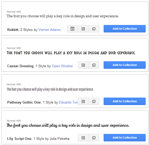
Font Styles and Your Style
Nobody knows your brand better than you do. When it comes to choosing appropriate font styles, part of the equation includes testing a few possible winners and trusting your intuition. As a general rule of thumb, you can and should use more than one font if your site contains a good deal of written content, without overdoing it. A common practice is pairing—using one font for titles and headlines and another for body text. Keep in mind that your website is one of the main faces of your business, and everything on it should reflect the nature of who you are and what you do. If you’re a job search and resume consulting firm, for example, Comic Sans is probably not your best bet (it almost never is!)
Readability
The best web design practices lead to web sites with text that is easy on the eyes. Readers aren’t going to be eager to peruse your written content, no matter how great it is, if looking at your site gives them a headache—and, if you’ve ever tried to look at an ugly web site with visually annoying text, you know exactly what we mean. Don’t make your customers squint to read product descriptions in a miniscule font size; somewhere between 12-14px is likely appropriate for body text (but preview it yourself to be sure.) Keep in mind, however, that with responsive web design, you may want to use several different sizes, depending on the size of the user’s display. For example, a 12-point font will look vastly different on a mobile phone and a desktop.
Avoid cursive fonts that make text difficult to read, make sure lines are appropriately spaced, and when you’re choosing font colors, be sure the contrast keeps your words clear. (If you’re having doubts, black text on a white background is always safe.)
Leading the Eye
You want your typography to help guide the reader’s eye to what you want him to see. Use bigger typeface, different font styles, and bolding or colors to draw the eye to headlines and titles. A great way to organize your written content is by using a grid. Seeing your text in symmetrical, equal-sized chunks will give you a much better idea of which parts require greater emphasis.
This, of course, is only the beginning. A terrific web designer can walk you through the small nuances of typography that make your site appealing, well organized, and (literally) easy on the eyes.
Ready to take the next step with your website topography? Start Here